Blog: Creating a Vintage‑Inspired Dog Grooming Brand.
DECEMBER 24/Chris Blackman
The Backstory
When Bryony approached me to create a brand for her dog grooming business, we started by discussing the normal things—what she wanted the brand to convey, who her customers were and how she hoped to be portrayed. From those early conversations and shared mood boards, it quickly became clear that she was drawn to a vintage aesthetic. She had a strong preference for the colour purple—a bold and distinctive choice that added character and sophistication to the brand
One non-negotiable was the inclusion of a mascot—a face for the brand that would bring it to life. But more on that later. With Bryony’s trust and plenty of creative freedom I set out to design a brand that captured her vision and stood out in a crowded market.
Naming the Brand
One of the biggest challenges in the dog grooming industry is standing out in a sea of predictable and overly cute names. Bryony wanted something professional, memorable and a little unexpected—something that hinted at the personality of the business without being too obvious. Bubbles and Paws, need not apply.
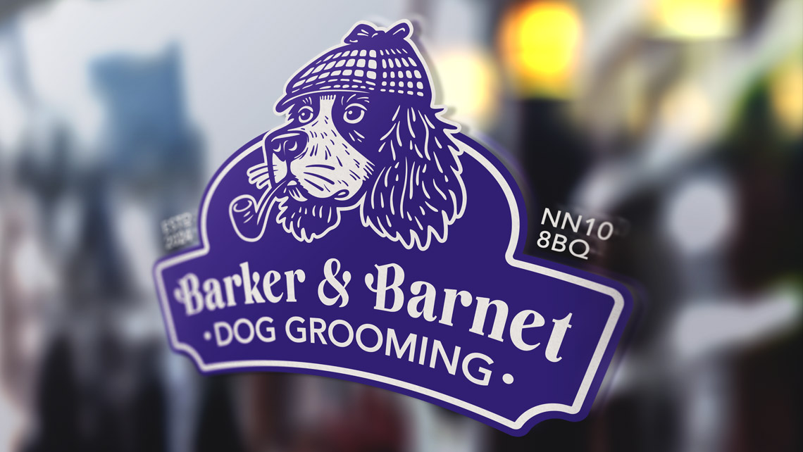
By adding a “Barker” (dog) to a bit of Cockney rhyming slang (Barnet Fair), Barker & Barnet was born. On the surface, it sounds as sophisticated as a firm of solicitors, but beneath that, it’s rather playful and fun.
Bryony loved the name immediately. It struck the ideal balance between personality and professionalism, setting the tone for the rest of the brand.
The Mascot
From the outset, Bryony was keen to have a mascot—something that would become the face of the brand and create a connection with customers. The inspiration came from her partner’s dog, Billy, whose charm and character perfectly aligned with the welcoming feel of the business.
The initial concepts closely reflected Billy, but unfortunately, with him being a mostly one-colour dog, his features were not as defined as we would have liked, particularly at smaller sizes. To solve this, we introduced subtle contrast by giving Billy a whiter muzzle (a typical feature for Spaniels), which helped define his overall design. This refinement marked the evolution into what we fondly called “Billy 2.0” from that point forward.
By giving him a pipe and a deerstalker hat, he took on a gentlemanly, sophisticated look, reinforcing the vintage style that underpins the brand. Billy 2.0 became more than just a mascot—he encapsulates the brand’s blend of fun and professionalism.
The Roll-Out
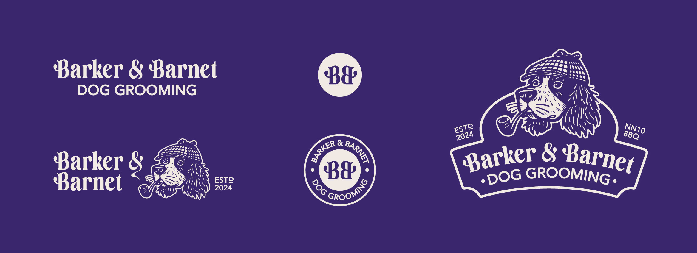
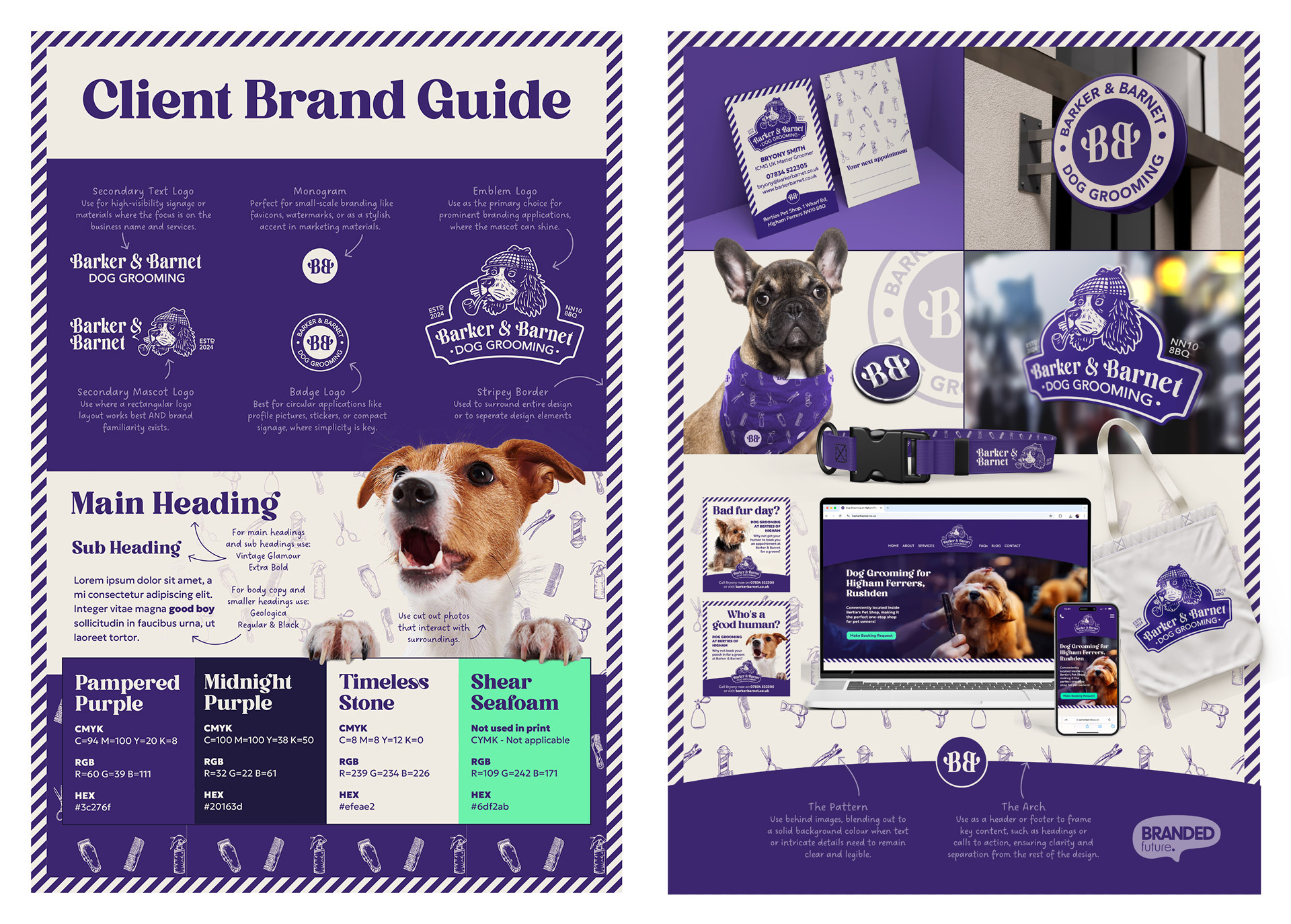
With the name and mascot in place, the next step was to bring the brand to life across all its touchpoints. Bryony wanted a brand that was adaptable, so we developed a full logo suite to ensure complete flexibility. From the primary emblem featuring Billy 2.0 to compact versions, each logo was designed with specific applications in mind—from large-scale signage to small icons. The monogram is a standout element, with two Bs facing each other, mimicking dogs with heads held high and wagging tails—presumably after a trip to Barker & Barnet!.
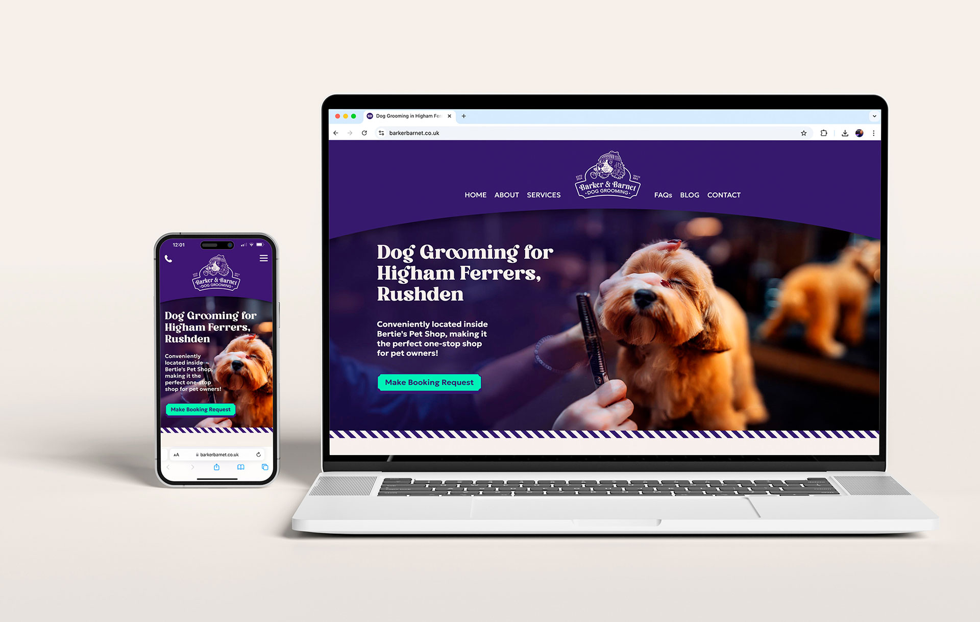
Colour was carefully considered to enhance the aesthetic. The palette is intentionally limited, avoiding stark whites in favour of a light stone colour that softens the overall look and gives the design a more refined and welcoming feel. Rich purples bring a sense of sophistication, while the Shear Seafoam colour was reserved exclusively for website buttons—a small pop of contrasting colour introduced to ensure clear and intuitive navigation.
The diagonal stripes—a subtle nod to the traditional barber’s pole—are used to surround or divide designs, creating a consistent visual thread that ties the brand elements together.
Typography also played a key role. The typeface used in headings is bold and very distinctive, evoking the feel of a classic barber shop. The logo starts with this already gorgeous typeface and, with custom edits, gives it a truly unique identity.
To ensure the brand looked polished wherever it appeared, we applied it consistently across a range of materials. This included appointment cards and signage, through to social media and, not forgetting, the website—all carefully designed to reflect the charm and professionalism of Barker & Barnet.
Conclusion
Creating the Barker & Barnet brand was a journey of collaboration, trust and shared vision. From its distinctive name to the playful yet sophisticated mascot, every detail was designed to reflect Bryony’s passion and vintage inspiration. The result is a cohesive and professional brand that stands out in a crowded market.
We wish Bryony every success in her new venture—be sure to check out her website: barkerbarnet.co.uk
Creative Lead at Branded Future. Perfectionist, father of twins, loser of golf balls, all-round creative with two decades of experience in the creative industry.